A well-designed cover photo not only enhances the visual appeal of your profile or page but also plays a significant role in conveying your brand message or personal identity. In this comprehensive guide, we’ll explore the current best practices for Facebook cover photo sizes, tips for creating a stunning cover photo, and common mistakes to avoid.
Understanding Facebook Cover Photo Dimensions

Current Dimensions
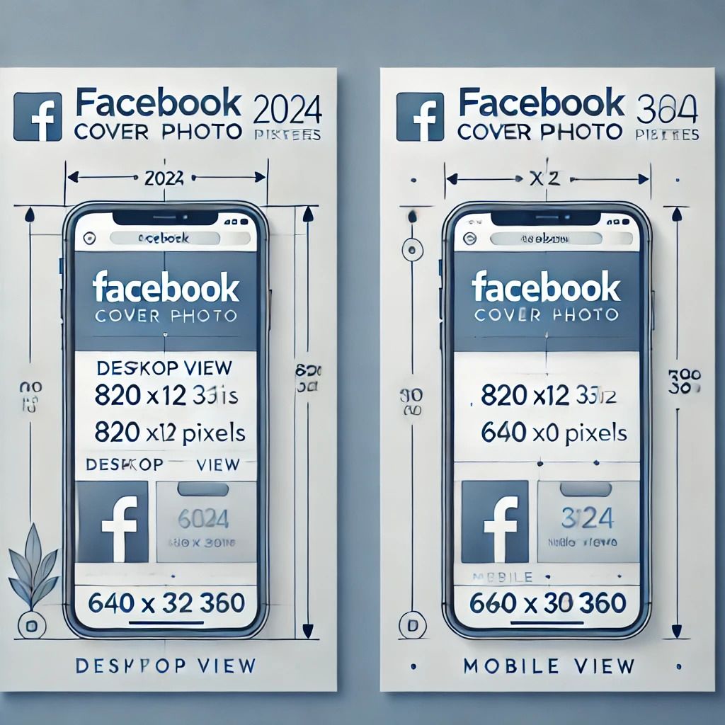
For 2025, the recommended dimensions for a Facebook cover photo are:
Desktop View: 820 x 312 pixels
Mobile View: 640 x 360 pixels
These dimensions ensure that your cover photo looks great on both desktop and mobile devices. It's important to note that Facebook resizes images to fit various screen sizes, so adhering to these dimensions will help ensure your photo displays correctly across different devices.
Why Dimensions Matter

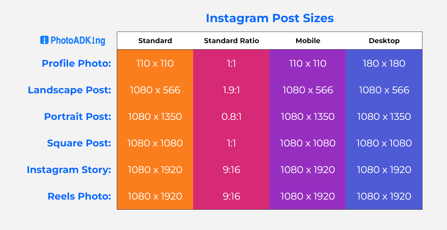
Using the correct dimensions for your Instagram content is vital for several key reasons:
Visual Appeal: When you use the right dimensions, your photos and videos maintain their clarity and high resolution. Images that are either too small or stretched beyond their optimal size can appear pixelated, blurry, or distorted. This can negatively affect how your content is perceived and reduce the professional quality of your posts. Properly sized images ensure that every detail is sharp, creating a polished and visually appealing profile that stands out on the platform.
User Experience: Correct dimensions also enhance the overall user experience, ensuring that your content displays properly across different devices—whether it's a smartphone, tablet, or desktop. Instagram automatically crops posts to fit various screen sizes, and using the recommended dimensions prevents important elements of your photos or videos from being cut off or hidden. For businesses or influencers, this is especially important because your cover photos or key visuals are often the first impression your audience gets, making it essential for brand consistency and professional presentation.
Increased Engagement: Optimized dimensions can directly influence engagement. When your content looks well-presented, it’s more likely to grab attention, stop users from scrolling, and encourage them to interact with your posts. Whether it's a full-screen Story, an eye-catching Reel, or a perfectly framed portrait post, content that looks good on any screen size is more likely to lead to likes, comments, and shares.
Consistency Across Platforms: Following Instagram’s recommended dimensions helps maintain consistency across your profile. This is crucial for brands aiming for a cohesive visual identity, as mismatched sizes or awkwardly cropped images can disrupt the flow of your feed. A consistent look not only makes your profile more aesthetically pleasing but also helps convey professionalism and attention to detail.
Best Practices for Facebook Cover Photo Design
Use High-Quality Images
To make your cover photo stand out, always start with high-resolution images. Low-quality visuals often appear pixelated, blurry, or grainy, which can detract from the professional look of your profile. Using sharp, clear images creates a stronger visual impact and conveys attention to detail.
For digital use, aim for a resolution of at least 72 DPI (dots per inch), which ensures that your image maintains clarity when viewed on screens. High-resolution images not only enhance the appeal of your cover photo but also contribute to a more polished and cohesive profile. Whether it’s a personal account or a business page, high-quality visuals play a key role in making a positive impression on viewers.
Keep Key Elements Centered
Facebook displays cover photos differently on desktop and mobile devices, with the central part of the image being the most visible on both platforms. Place crucial information or visual elements—such as text, logos, or faces—in the central area of your cover photo. This ensures that these elements are not cropped or hidden on different devices.
Avoid Text Clutter
Although it might be tempting to cram a lot of information into your cover photo, excessive text can make it appear cluttered and unprofessional. To maintain a clean and effective design, keep text to a minimum and ensure it is easily readable. Use clear, large fonts and choose colors that contrast well with the background to enhance legibility. This approach helps your cover photo look more polished and ensures that your key message is communicated effectively without overwhelming viewers.
Optimize for Branding
For businesses and brands, the cover photo is an essential branding asset that can make a significant impact on your profile’s effectiveness:
Incorporate Your Logo: Position your logo prominently to enhance brand visibility and recognition. Ensure it is clear and legible, even when viewed on different devices, so viewers can instantly connect the visual with your brand.
Use Brand Colors: Apply your brand’s color scheme to the cover photo to maintain visual consistency across your profile. This helps reinforce your brand’s identity and ensures that your cover photo aligns with other branding materials.
Highlight Key Messages: Include succinct and impactful messages or taglines that reflect your brand’s core values or current campaigns. Keep text minimal but meaningful, ensuring it supports your brand’s objectives without overwhelming the design.
Align with Branding Strategy: Ensure that the overall design of your cover photo is in harmony with your brand’s visual and messaging strategy. If you’re looking to achieve a polished and professional look without stretching your resources, consider leveraging Outsource Graphic Design services. This approach allows you to create designs that effectively convey your brand’s personality and tone while maintaining a cohesive and professional appearance.
Effective Visual Communication: Aim for a design that quickly communicates your brand’s message and values. A well-designed cover photo should make a strong first impression, capturing the essence of your brand in a way that resonates with your audience.
Use a Consistent Design
Consistency is key in branding. Ensure that your cover photo design aligns with your other social media profiles and marketing materials. This creates a cohesive look and reinforces your brand identity across all platforms.
How to Create an Effective Facebook Cover Photo

Step 1: Choose the Right Tool
There are numerous tools available for creating and designing Facebook cover photos. Popular options include graphic design software like Adobe Photoshop, online design platforms like Canva, and specialized cover photo tools. These tools offer templates and customization options to help you design a cover photo that meets the required dimensions and looks professional.
Step 2: Design with Mobile in Mind
Since many users access Facebook on mobile devices, it's crucial to design your cover photo with mobile view in mind. Preview how your design looks on both desktop and mobile devices to ensure that it appears as intended across all platforms. Many design tools offer a preview feature that allows you to see how your cover photo will look on different devices.
Step 3: Test and Adjust
Before finalizing your cover photo, test it by uploading it to your Facebook profile or page. Check how it appears on both desktop and mobile devices and make any necessary adjustments. Ensure that all important elements are visible and that the photo looks clear and professional.
Common Mistakes to Avoid
Ignoring Mobile Optimization
One of the most common mistakes is designing a cover photo that looks good only on desktop but not on mobile. Since a significant portion of Facebook users access the platform via mobile devices, it’s essential to ensure that your cover photo is optimized for mobile viewing.
Using Outdated Dimensions
Facebook frequently updates its design and layout, which can impact cover photo dimensions. Using outdated dimensions can result in a cover photo that appears distorted or cropped. Always refer to the latest guidelines for the most accurate dimensions.
Overloading with Information
Including too much information or too many elements in your cover photo can make it look cluttered and overwhelming. Keep your design simple and focused, highlighting only the most important information or visuals.
Not Testing Across Devices
Failing to preview your cover photo on different devices can lead to issues with visibility and design. Always test your cover photo on both desktop and mobile devices to ensure it appears as intended.
Conclusion
By following the recommended dimensions and best practices outlined in this guide, you can create a cover photo that looks professional, communicates your message effectively, and enhances your online presence. Regularly update your cover photo to keep your profile or page looking fresh and engaging.
By adhering to these guidelines, you can ensure that your Facebook cover photo not only meets the technical requirements but also serves as a powerful tool for branding and visual appeal.
Take Control of Your Social Media with Planly
Looking for an easier way to manage your Facebook cover photos and other social media content? Planly is the perfect solution for scheduling, organizing, and optimizing your posts across multiple platforms. With Planly, you can plan your social media strategy ahead of time, ensuring that your content is always on-brand and perfectly timed.
Try Planly today and streamline your social media management effortlessly!


